We’ve been in our home now for 2.5 years and it still feels very much like a work in progress. I can easily think of a few rooms that could use some sprucing up! I guess that is how having a home is? The room that has all my attention at the moment though is our dining room which I would like to also function as an everyday eating area. It is separated from our kitchen, but still part of the main living space, has hardwood floors and the only table big enough to seat us all. It is also the first space you see from the front door which makes this decorating project feel extra intimidating to me.
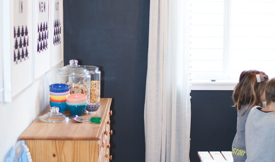
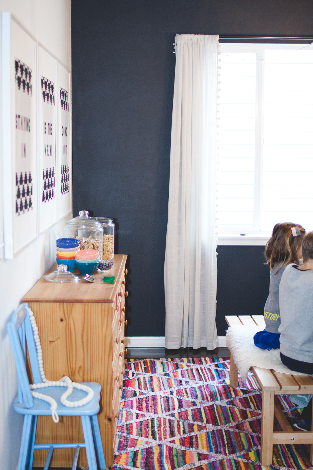
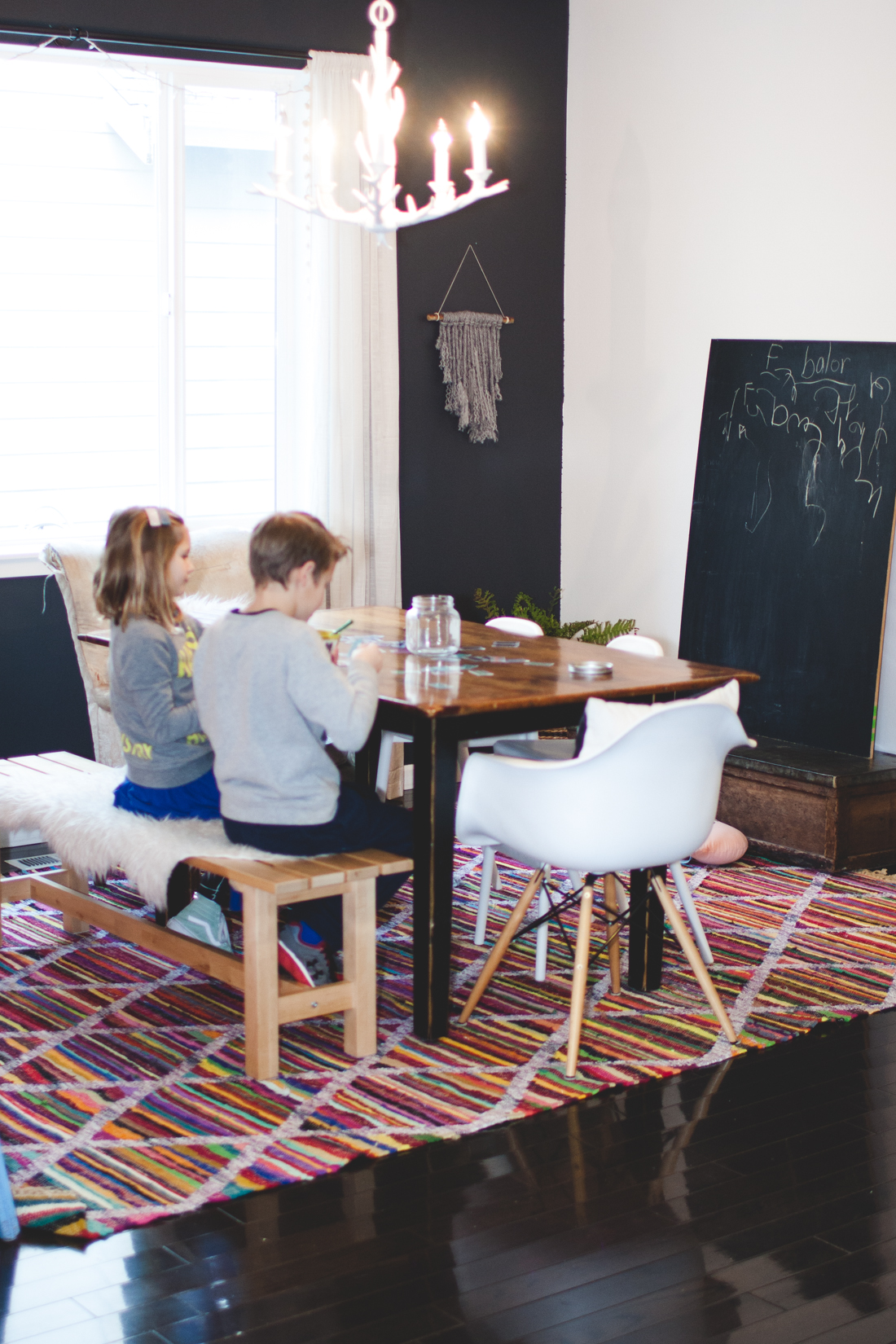
Here’s what it currently looks like:
A few of the things I know I want to do is take the rug out and possibly replace with a jute rug (with the hopes of layering in the future), add 4 more white eames chairs, paint the buffet a pretty green color, add gold nobs, and then hang big statement piece of art or a collage wall over it.
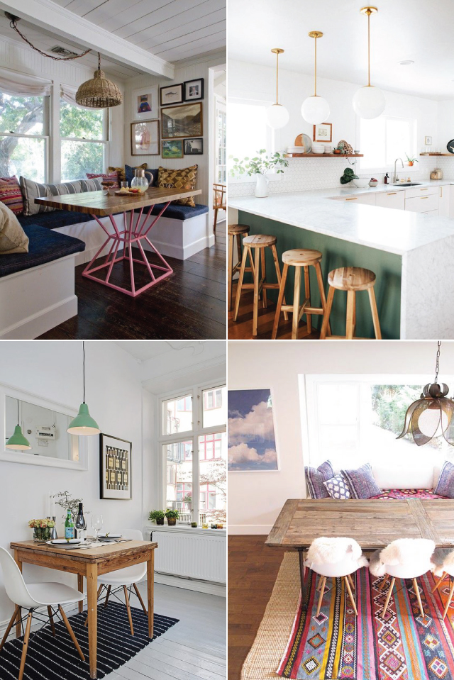
After that, I’m kinda stumped as to how to pull it all together! So last week I turned to Pinterest and started pulling images of dinning room and kitchen spaces I really like. Not surprisingly, and probably why I have a hard time starting or finishing my decorating projects, I could easily group my favorites into 3 categories…
ONE | bright + white
TWO: moody
THREE | bright + moody (basically a combo of the two)
Now I just have to decide which direction to go and I’m hoping you can help by answering a couple questions in the comments!?
- collage wall or oversized art?
- your favorite style — bright + white, moody, or bright + moody
Can’t wait to see what you pick!
XO, Rae


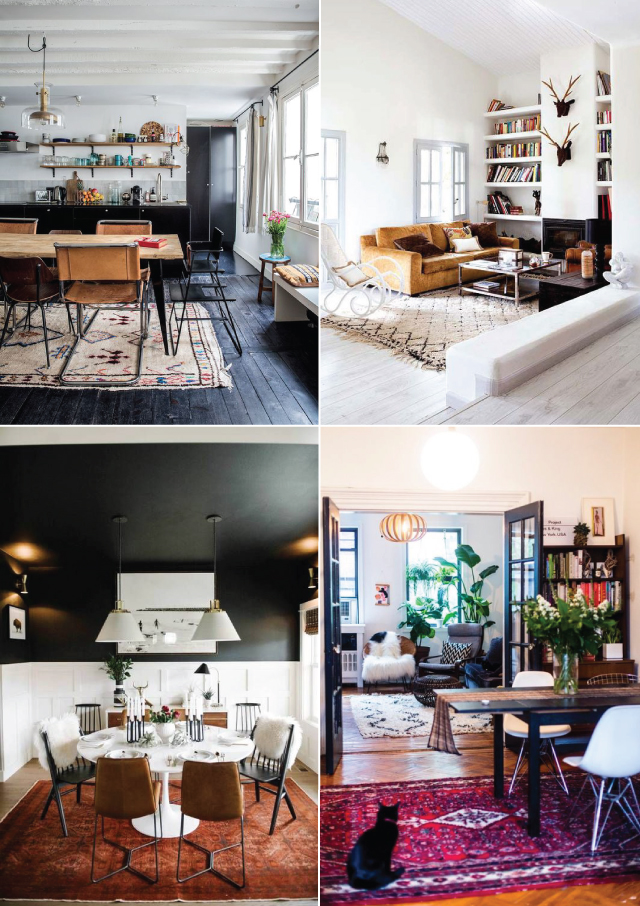
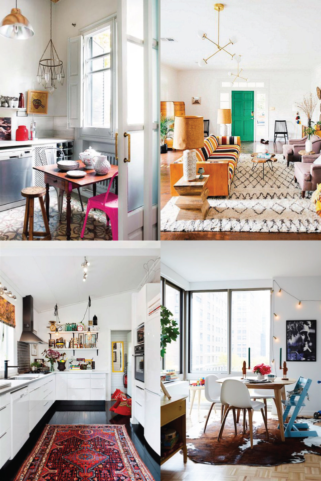
I LOVE the bright white. I think I’m into bright white but including a bit of moodiness tempers it (which my husband often wants). I think a collage could be cool, I was searching for images of custom photo wallpaper today. I think that would be SO fun but again, not sure I can get the rest of the family on board.
bright + white for sure
one big piece. I would love to have a big canvas of mountains with a small trail leading into some wildflowers A piece that makes me dream of chasing that adventure.
Do you think you’ll deal with stains on the jute rug?
We have 5 kids + carpet in our dining room and that is the number one thing I would change about our house. My dreams are about wood floors!
such a good question and i agree — wood floor everywhere! i think there are pros and cons to both. having a jute rug means i can wait longer to clean up under the table and chairs since the color and texture does a good job of hiding it, but then theres spills and stains. so hard to decide!
You can call your blended style BROODY ;) Isn’t it hard to nail down a style when there is so much wonderfulness out there? I like the white with playful colors, feels open and airy. But I also have a strong tendency to lean toward woods, leather, neutrals and plants. Oh boy, have fun designing!
i’m the same way! loved reading your comment. thanks so much for sharing! XO, Rae
Wow! I think I like the bright and moody. Definitely oversized wall.
I love the bright and white, especially with the dark wood floors. I don’t think you could go wrong with a collage or big piece. Collage is always good for me and my indecisiveness :).
My vote is bright and moody….best of both! Also I vote for an oversized piece of art. If you do opt for a collage maybe do a picture ledge which is a bit more modern and cleaner looking. Also that way you can change up your artwork without worrying about holes. Love the wall colour and I do like the yarn hanging…provides some nice texture to the space. Try adding some hanging plants or tall plants in the corner. I can’t quite tell but if you do not have blinds maybe layer some bamboo ones with the existing curtains to warm the space up a bit. A jute rug with a vintage Persian layered would l look really nice. Can’t wait to see what you do!
I am all for bright and moody– what a great combo of both styles. I would also go for oversized art. I always like the idea of a gallery wall, but rarely think it gets pulled off well. The frames can often look like they are floating too much.
Option one (bright and white) seemed the closest to your aesthetic according to what we’ve seen here, in large part because it’s got so many great pops of bright color! The very first photo has dark floors – you could pull in some of that moody vibe while keeping it clean and bright. Can’t wait to see what you decide!